Exploring the fundamentals of color is essential for anyone seeking to elevate their artistic abilities and understanding of visual storytelling. The interconnectedness of colors and the way they interact on a canvas can transform a simple piece into a compelling narrative. Here, we delve into the essentials of color principles to enhance your artistic journey.
The Basics
At its core, color theory is the science and art of using color. It encompasses the ways that artists mix colors, the visual effects of specific color combinations, and the messages that colors can convey. Recognizing how colors work together—or contrast sharply—enables you to create depth and balance in your artwork.
The Color Wheel
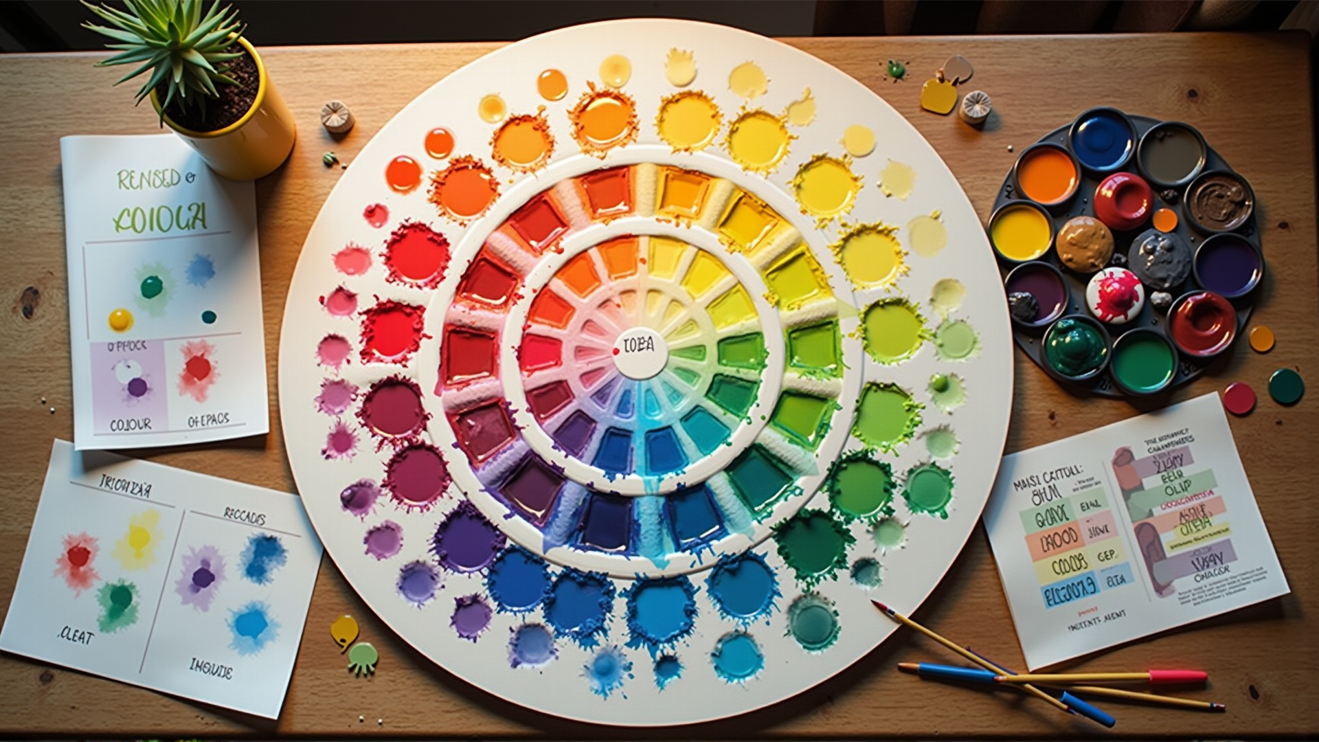
The color wheel is a fundamental tool for artists. Developed by Sir Isaac Newton in 1666, the wheel displays relationships between colors. It consists primarily of three categories:
- Primary Colors: Red, blue, and yellow—cannot be created by mixing other colors.
- Secondary Colors: Green, orange, and purple—created by mixing primary colors.
- Tertiary Colors: The result of mixing a primary color with a secondary color (e.g., blue-green, red-orange).
Color Relationships
Understanding the relationships between different hues is key. These relationships are often categorized as:
- Complementary: Positioned opposite each other on the color wheel, such as blue and orange. This pairing creates a vibrant look and can highlight each color.
- Analogous: Located next to each other on the wheel, such as green, yellow-green, and yellow. These harmonize well and are pleasing to the eye.
- Triadic: Consists of three colors which are evenly spaced around the wheel, such as red, yellow, and blue. This scheme offers a balanced and vibrant contrast.
- Monochromatic: Variations in lightness and saturation of a single color. This is useful for creating a unified and cohesive look.
The Role of Color in Storytelling
Colors can evoke emotions and set the overall mood of a piece. For instance, warm colors like red, orange, and yellow can convey passion, warmth, or energy. In contrast, cool colors like blue, green, and purple often evoke calm, tranquility, or sadness. Being mindful of these emotional ties helps artists to communicate more effectively through their work.
Practical Application
To apply these concepts, start by experimenting with different palettes. Create trial artworks focusing on specific schemes—such as complementary or analogous—and observe the impact on mood and story. Consider how varying the lightness and saturation alters the perception of each piece.
Conclusion
By grasping the principles of color theory, you can enhance your ability to create compelling and thought-provoking art. Colors are more than just visual tools; they are a language of emotion that can transform static images into a profound experience. Whether you're just beginning your artistic journey or are a seasoned creator, understanding how to use color harmoniously will undoubtedly enrich your work.